Chapter 2: Understanding Bayesian Priors in Economic Analysis
In Bayesian analysis, the PRIOR is a probability distribution that represents our knowledge or beliefs about a parameter before we observe any data. It's essentially our initial guess or assumption about the parameter's value.
Detailed Explanation
- Definition: The prior distribution, denoted as P(θ), is the probability distribution of the parameter θ before considering the current data. It reflects what we know about θ based on previous information, expert opinion, or historical data.
- Example: Suppose we want to estimate the probability of a coin landing heads. Before flipping the coin, we might believe that the coin is fair, so our prior distribution for the probability of heads (θ) could be a uniform distribution between 0 and 1.
-
Bayes' Theorem: Bayesian analysis uses Bayes' theorem to update the prior distribution with new data to obtain the posterior distribution. The formula is:
$$P(\theta | data) = \frac{P(data | \theta) \cdot P(\theta)}{P(data)}$$
- P(θ | data): Posterior distribution (probability of θ given the data)
- P(data | θ): Likelihood (probability of the data given θ)
- P(θ): Prior distribution (probability of θ)
- P(data): Evidence (probability of the data)
- Updating the Prior: When new data is observed, the prior distribution is updated to the posterior distribution using the likelihood of the new data. This updated posterior distribution becomes the new prior if more data is collected in the future.
Types of Prior Distributions: A Detailed Examination
Understanding Different Prior Types
In economic analysis, we typically work with three main types of priors, each serving different purposes and reflecting different levels of existing knowledge:
1. Uninformative Priors
- Purpose: Express minimal information about the parameter
- Economic Use: When analyzing new markets or unprecedented economic phenomena
- Example: Analyzing cryptocurrency market behavior in its early stages
2. Weakly Informative Priors
- Purpose: Provide some constraints while remaining relatively flexible
- Economic Use: When we have some theoretical guidance but limited empirical evidence
- Example: Estimating the impact of new technology on productivity
3. Informative Priors
- Purpose: Express strong beliefs based on substantial evidence
- Economic Use: When analyzing well-studied economic relationships
- Example: Estimating price elasticity in established markets
Visualizing and Understanding Different Prior Types
# funnction to compare all prior types with detailed visualisation
compare_all_priors <- function() {
  x <- seq(0, 1, length.out = 1000)

  # calculate densities for each prior
  uninformative <- dbeta(x, 1, 1)
  weakly_informative <- dbeta(x, 2, 2)
  informative <- dbeta(x, 8, 2)

  # cmbine into data frame
  plot_data <- data.frame(
    x = rep(x, 3),
    density = c(uninformative, weakly_informative, informative),
    Prior = factor(rep(c("Uninformative (Beta(1,1))",
                        "Weakly Informative (Beta(2,2))",
                        "Informative (Beta(8,2))"),
                      each = length(x)))
  )

  # Create comparison plot
  ggplot(plot_data, aes(x = x, y = density, color = Prior)) +
    geom_line(size = 1.2) +
    labs(title = "Comparing Different Types of Prior Distributions",
         subtitle = "Economic Parameter Estimation Using Beta Distributions",
         x = "Parameter Value",
         y = "Density") +
    theme_minimal() +
    theme(legend.position = "bottom",
          plot.title = element_text(hjust = 0.5, size = 14),
          plot.subtitle = element_text(hjust = 0.5, size = 12),
          legend.text = element_text(size = 10)) +
    scale_color_manual(values = c("blue", "forestgreen", "red"))
}

# generate comparison plot
prior_comparison <- compare_all_priors()
prior_comparison

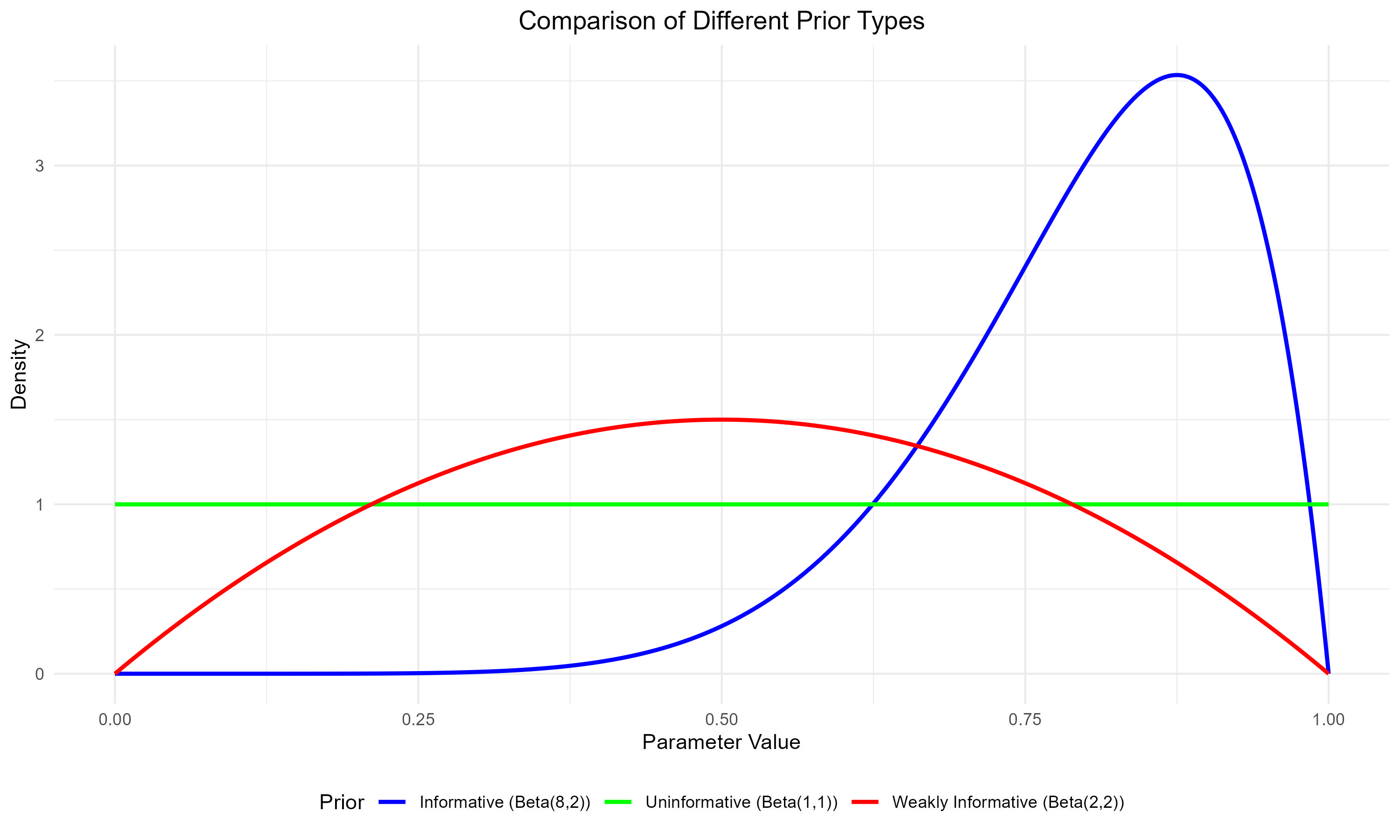
Figure: Comparison of Different Prior Distributions in Economic Analysis
Understanding the Prior Distributions
Green Line: Uninformative Prior (Beta(1,1))
- Shape: Completely flat line across all values
- Meaning: Equal probability for all possible parameter values
- Economic Example: When analyzing a completely new market or economic phenomenon
- Example: Estimating adoption rates for a revolutionary technology
- Use when: No reliable historical data or theoretical guidance exists
Red Line: Weakly Informative Prior (Beta(2,2))
- Shape: Gentle hill shape, slightly favoring middle values
- Meaning: Mild preference for moderate values while still allowing for extremes
- Economic Example: Estimating price elasticity in an emerging market
- Example: New product category with some similarities to existing markets
- Use when: You have general economic theories but limited specific data
Blue Line: Informative Prior (Beta(8,2))
- Shape: Strongly peaked curve, concentrated in a specific region
- Meaning: Strong beliefs about likely parameter values
- Economic Example: Estimating returns in established markets
- Example: Analyzing price effects in mature consumer goods markets
- Use when: Substantial historical data and robust theoretical understanding exists
Some Additional Information
- Data Requirements:
- Uninformative prior: Requires more data to reach precise conclusions
- Informative prior: Can reach meaningful conclusions with less data
- Robustness:
- Uninformative prior: More robust to unexpected patterns
- Informative prior: More efficient when assumptions are correct
- Application:
- Choose based on confidence in prior knowledge
- Consider sensitivity analysis with different priors for important decisions
Understanding Priors (Some Examples): The Market Intuition
Think of Bayesian priors like market expectations. Just as stock prices reflect all currently available information before new earnings announcements, priors represent our collective knowledge before seeing new data.
Market Analogy
Imagine you're investing in a company:
- Prior Knowledge (Your Prior): Historical performance, industry trends, management quality
- New Information (Data): Quarterly earnings report
- Updated View (Posterior): Your revised investment decision
This is exactly how Bayesian analysis works in economics!
Why Priors Matter in Economic Decision Making
Real-World Applications
- Central Bank Policy
- Prior belief: Relationship between interest rates and inflation
- New data: Monthly economic indicators
- Decision: Interest rate adjustments
- Market Analysis
- Prior belief: Seasonal patterns in consumer spending
- New data: Current sales figures
- Decision: Inventory management
- Policy Impact Assessment
- Prior belief: Effect of minimum wage on employment
- New data: Regional employment statistics
- Decision: Policy recommendations
Bayesian vs. Frequentist: A Practical Comparison
| Aspect | Frequentist Approach | Bayesian Approach | Economic Implication |
|---|---|---|---|
| Uncertainty | Fixed parameters, random data | Random parameters, fixed data | Better reflects market uncertainty |
| Small Samples | Often unreliable | Can leverage prior knowledge | Useful for rare economic events |
| Updating | Requires complete reanalysis | Sequential updating possible | Ideal for real-time economic monitoring |
| Interpretation | p-values, confidence intervals | Direct probability statements | More intuitive for policy makers |
The Power of Priors: Economic Advantages
Why Economists Love Bayesian Methods
- Handling Limited Data
Many economic questions have limited data (think major policy changes or financial crises). Bayesian methods let us combine sparse data with economic theory.
- Real-Time Decision Making
Central banks can't wait for decades of data to make decisions. Priors help make informed choices with incomplete information.
- Model Uncertainty
Economics often has competing theories. Bayesian methods let us weight different models and combine their insights.
Case Study 1: GDP Growth Rate Analysis
Understanding Growth Rate Expectations
When analyzing GDP growth rates, economists consider different scenarios based on varying levels of economic optimism and uncertainty:
1. Conservative Growth Scenario
- Expectation: Moderate, stable growth around 2%
- Uncertainty: Low - high confidence in estimate
- Economic Context: Mature economies in stable periods
2. Optimistic Growth Scenario
- Expectation: Higher growth around 3.5%
- Uncertainty: Moderate
- Economic Context: Emerging markets or recovery periods
3. Uncertain Growth Scenario
- Expectation: Moderate growth but highly uncertain
- Uncertainty: High - wide range of possible outcomes
- Economic Context: Periods of structural change or crisis
# function to compare different GDP growth scenarios
compare_growth_scenarios <- function() {
  x <- seq(-0.05, 0.10, length.out = 1000)  # Range from -5% to 10% growth

  # calculate densities for different scenarios
  conservative <- dnorm(x, mean = 0.02, sd = 0.01)
  optimistic <- dnorm(x, mean = 0.035, sd = 0.015)
  uncertain <- dnorm(x, mean = 0.02, sd = 0.03)

  # Combine into data frame
  plot_data <- data.frame(
    x = rep(x, 3),
    density = c(conservative, optimistic, uncertain),
    Scenario = factor(rep(c("Conservative (μ=2%, σ=1%)",
                        "Optimistic (μ=3.5%, σ=1.5%)",
                        "Uncertain (μ=2%, σ=3%)"),
                      each = length(x)))
  )

  # Crreate comparison plot
  ggplot(plot_data, aes(x = x, y = density, color = Scenario)) +
    geom_line(size = 1.2) +
    labs(title = "Different Scenarios for GDP Growth Rate Expectations",
         subtitle = "Comparing Various Growth Outlooks",
         x = "GDP Growth Rate",
         y = "Density") +
    theme_minimal() +
    theme(legend.position = "bottom",
          plot.title = element_text(hjust = 0.5, size = 14),
          plot.subtitle = element_text(hjust = 0.5, size = 12),
          legend.text = element_text(size = 10)) +
    scale_x_continuous(labels = scales::percent) +
    scale_color_manual(values = c("blue", "forestgreen", "red"))
}

# Generate comparison plot
growth_scenarios_comparison <- compare_growth_scenarios()
growth_scenarios_comparison

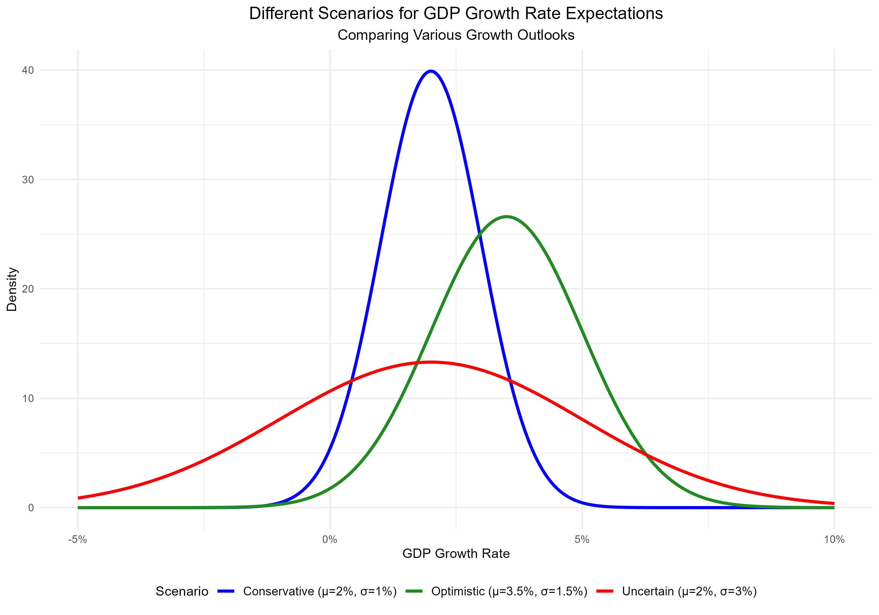
Figure: Comparison of Different GDP Growth Rate Scenarios
Understanding the Growth Scenarios
Blue Line: Conservative Growth Scenario
- Shape: Narrow, peaked distribution centered at 2%
- Interpretation: High confidence in moderate growth
- Economic Context:
- Typical for developed economies in stable periods
- Based on well-established historical patterns
- Limited deviation expected from the mean
Green Line: Optimistic Growth Scenario
- Shape: Slightly wider distribution centered at 3.5%
- Interpretation: Expectation of higher growth with moderate uncertainty
- Economic Context:
- Common in emerging markets or recovery phases
- Incorporates positive structural changes
- Allows for more variation in outcomes
Red Line: Uncertain Growth Scenario
- Shape: Wide, flattened distribution centered at 2%
- Interpretation: High uncertainty about growth prospects
- Economic Context:
- Typical during major economic transitions
- Reflects structural uncertainties
- Accommodates wide range of possible outcomes
Case Study 2: Monetary Policy Effects
Understanding Monetary Policy Transmission
When analyzing how interest rates affect inflation, central banks consider different scenarios about policy effectiveness:
1. Strong Policy Effect
- Expectation: Significant negative impact on inflation
- Magnitude: Large response to rate changes
- Context: Well-functioning monetary transmission mechanisms
2. Moderate Policy Effect
- Expectation: Moderate impact on inflation
- Magnitude: Standard policy effectiveness
- Context: Normal economic conditions
3. Weak Policy Effect
- Expectation: Limited impact on inflation
- Magnitude: Reduced policy effectiveness
- Context: Structural impediments or near zero-lower bound
# Function to compare different monetary policy effects
compare_policy_effects <- function() {
  x <- seq(-1.5, 0.5, length.out = 1000)

  # Calculate densities for different scenarios
  strong_effect <- dnorm(x, mean = -0.5, sd = 0.15)
  moderate_effect <- dnorm(x, mean = -0.3, sd = 0.2)
  weak_effect <- dnorm(x, mean = -0.1, sd = 0.1)

  # Combine into data frame
  plot_data <- data.frame(
    x = rep(x, 3),
    density = c(strong_effect, moderate_effect, weak_effect),
    Effect = factor(rep(c("Strong Effect (μ=-0.5, σ=0.15)",
                         "Moderate Effect (μ=-0.3, σ=0.2)",
                         "Weak Effect (μ=-0.1, σ=0.1)"),
                      each = length(x)))
  )

  # Create comparison plot
  ggplot(plot_data, aes(x = x, y = density, color = Effect)) +
    geom_line(size = 1.2) +
    geom_vline(xintercept = 0, linetype = "dashed", color = "gray") +
    labs(title = "Different Scenarios of Monetary Policy Effectiveness",
         subtitle = "Impact of Interest Rates on Inflation",
         x = "Policy Effect Coefficient",
         y = "Density") +
    theme_minimal() +
    theme(legend.position = "bottom",
          plot.title = element_text(hjust = 0.5, size = 14),
          plot.subtitle = element_text(hjust = 0.5, size = 12),
          legend.text = element_text(size = 10)) +
    scale_color_manual(values = c("blue", "forestgreen", "red"))
}

# Generate comparison plot
policy_effects_comparison <- compare_policy_effects()
policy_effects_comparison
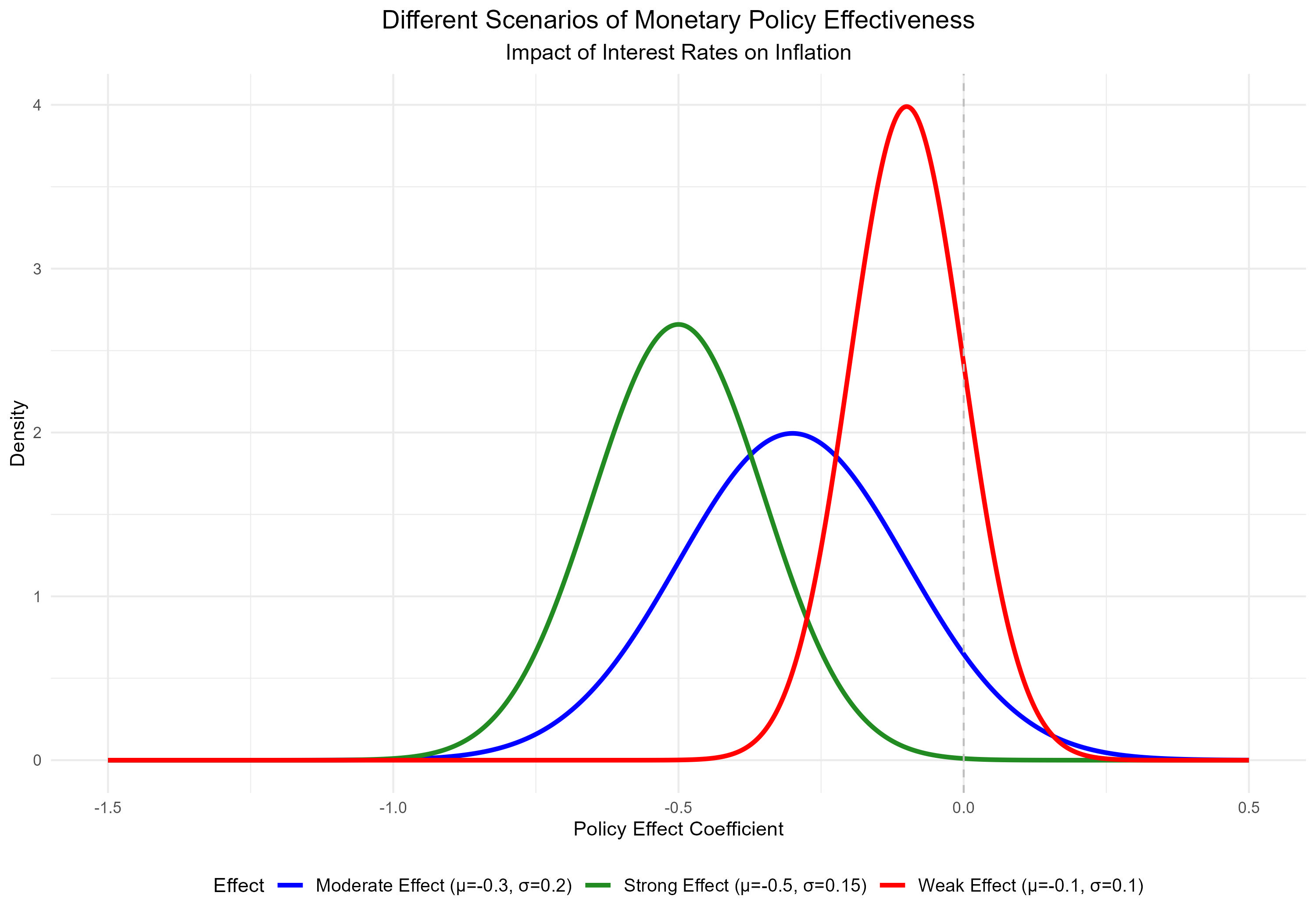
Figure: Comparison of Different Monetary Policy Effect Scenarios
Understanding the Monetary Policy Scenarios
Green Line: Strong Policy Effect
- Shape: Sharp peak far from zero, relatively narrow spread
- Interpretation: High confidence in strong policy transmission
- Economic Context:
- Well-functioning financial markets
- High credit channel effectiveness
- Strong central bank credibility
Blue Line: Moderate Policy Effect
- Shape: Broader distribution with moderate negative mean
- Interpretation: Standard policy effectiveness with some uncertainty
- Economic Context:
- Normal economic conditions
- Typical transmission mechanisms
- Average market responsiveness
Red Line: Weak Policy Effect
- Shape: Peak closer to zero, narrow spread
- Interpretation: Limited policy effectiveness
- Economic Context:
- Near zero lower bound
- Impaired transmission mechanisms
- Structural economic challenges
Conclusion
Bayesian methods offer economists powerful tools for incorporating prior knowledge, handling uncertainty, and making decisions with limited data. The ability to update beliefs systematically as new information arrives makes these methods particularly valuable for policy analysis and economic forecasting.
Key Takeaways
- Priors provide a formal way to incorporate economic theory and expert knowledge
- Bayesian updating allows for dynamic decision-making in economic policy
- Hierarchical models help analyze complex economic structures
- Sensitivity analysis ensures robust economic conclusions